Layout and Rendering
The widget, element, render, and layer trees, then Flexible, slivers, render objects, RepaintBoundary, custom painting, lerp, and the engine underneath.
The four trees
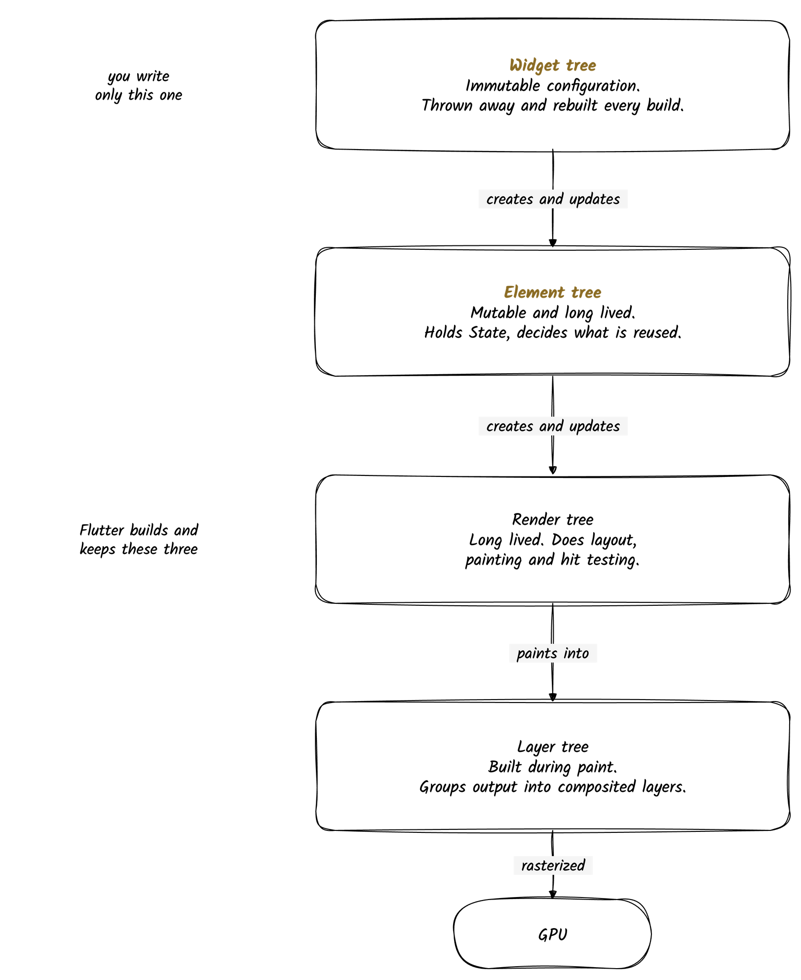
Flutter does not keep one tree of widgets. It keeps four, and each one exists because the others cannot do its job.
| Tree | Lifetime | Job |
|---|---|---|
| Widget | Rebuilt constantly | Describes what the UI should look like |
| Element | Long lived | Reconciles rebuilds and holds state |
| Render | Long lived | Layout, painting, hit testing |
| Layer | Rebuilt during paint | Groups painted output for the GPU |
The split is what lets Flutter give you an immutable, declarative API on top and still repaint only the part of the screen that actually changed.
The widget tree
Widgets are immutable descriptions. They are cheap to create, cheap to throw away, and they hold no state of their own.
MaterialApp(
  home: Scaffold(
    appBar: AppBar(title: Text('My App')),
    body: Center(
      child: Text('Hello World'),
    ),
  ),
)
Every setState() runs build() again and produces a brand new widget tree. Nothing is patched in
place. The old tree is compared against the new one and then discarded.
The kinds you build with:
StatelessWidget: no internal stateStatefulWidget: rebuilds itself when itsStatechangesInheritedWidget: pushes data down the subtree, see widgets-state-and-lifecycleRenderObjectWidget: the low level widgets that create render objects
The element tree
Elements are the mutable layer that survives rebuilds. There is one element per widget, and the
element holds a reference to its current widget, its State if it has one, and its render object if
it creates one.
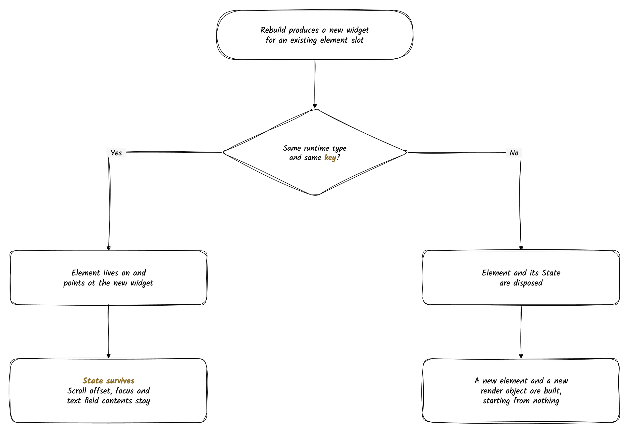
When a new widget tree arrives, each element compares itself against the new widget in its slot:
- Same runtime type and same key: the element keeps living and just points at the new widget
- Different type or different key: the element is thrown away and a new one is built
That single rule is why scroll position, focus, and text field contents survive a rebuild, and why a wrong key resets them. Keys are covered in widgets-state-and-lifecycle.
The element types mirror the widget types:
ComponentElement: built from widgets that compose other widgetsStatelessElementfrom aStatelessWidgetStatefulElementfrom aStatefulWidget, and it owns theStateobject
RenderObjectElement: creates and updates a render objectLeafRenderObjectElement,SingleChildRenderObjectElement,MultiChildRenderObjectElement
ProxyElement: built fromInheritedWidgetand other proxy widgets
The render tree
Render objects are what elements create when there is something to actually draw. They do layout, painting, and hit testing, and they are the expensive objects in the system, so they are reused across rebuilds wherever the element tree allows it. They get their own section below.
The layer tree
Painting does not produce pixels. It produces a tree of layers, which is what gets handed to the rasterizer. Layers are created during the paint phase, and only the layers that changed have to be repainted on the next frame.
PictureLayer: the actual drawing commands for a regionContainerLayer: base class for layers with childrenOffsetLayer: shifts its children by an offsetClipRectLayer: clips its children to a rectangleOpacityLayer: applies transparencyTransformLayer: applies a matrix transformTextureLayer: shows external texture content, for video or a camera feed
RepaintBoundary is how you deliberately create one of these, which is the whole point of the next
section but one.
How a frame moves through them
setState()
   |
build      new widget tree
   |
reconcile  element tree updates in place where type and key match
   |
layout     render objects size and position themselves
   |
paint      render objects emit painting commands into layers
   |
composite  the layer tree goes to the rasterizer and then the GPU
Each step only touches what the step before it marked dirty. A widget rebuild does not imply a relayout, and a relayout does not imply a repaint of the whole screen.
How this differs from Android and iOS
Android View objects and iOS UIView objects are the UI. They are mutable, long lived, and you
change the interface by reaching into them and setting properties, then invalidating what you
touched. That is the imperative model.
Flutter splits that single mutable object into the four trees above. You only ever write the immutable one. You describe the UI for the current state, and the element tree works out what that means for the long lived objects underneath.
| Flutter | Android and iOS views | |
|---|---|---|
| Model | Declarative, describe the result | Imperative, describe the steps |
| What you hold | Immutable widgets, thrown away each build | Mutable view objects, kept and edited |
| Updating | Rebuild, then diff against the element tree | Set properties and invalidate by hand |
| Cost of a "rebuild" | Cheap, widgets are configuration | Expensive, views are real objects |
The practical payoff is that UI state cannot drift out of sync with app state, because the UI is recomputed from that state rather than patched toward it.
Flexible
Flexible controls how a child of a Row, Column, or Flex shares the space along the main axis.
A Flexible child can expand or shrink with the space available. Unlike Expanded, it does not
force the child to fill everything it is given.
| Property | Type | What it does |
|---|---|---|
flex | int | Share of space relative to its siblings. Defaults to 1 |
fit | FlexFit | FlexFit.tight makes the child fill its allocation, FlexFit.loose lets it be smaller |
child | Widget | The widget being sized |
How flex works
flexis a ratio that determines how much space a child should take relative to its siblings inside aRow,Column, orFlex.- Total available space = parent size minus fixed-size children.
- Each child with a
flexgets a fraction of the remaining space proportional to itsflex.
Row(
  children: [
			  Flexible(flex: 1, child: Container(color: Colors.red)),
              Flexible(flex: 2, child: Container(color: Colors.blue)),
              Flexible(flex: 7, child: Container(color: Colors.pink)),
  ],
)
Calculation:
- Total flex = 1 + 2 + 7 = 10
- Red → 1/10 of remaining width
- Blue → 2/10 of remaining width
- Pink → 7/10 of remaining width
Key notes about flex
flexworks only for Flexible/Expanded children.- Default
flexis1if not specified. flexis relative: it doesn't specify exact pixels, only ratios.- You can mix
flexchildren with fixed-size children: fixed-size widgets take their size first, thenflexwidgets divide remaining space. - Expanded is a shorthand for
Flexible(fit: FlexFit.tight) - Default fit is
FlexFit.loose
Widgets vs slivers
Widgets and slivers are both fundamental concepts in Flutter development, but they serve different purposes and operate at different levels in the rendering pipeline.
Widgets
Widgets are the basic building blocks of Flutter's UI. They are immutable descriptions of part of the user interface.
Key characteristics of widgets:
- Composition: Widgets form a tree structure where each widget can have child widgets.
- Immutability: Widgets are immutable. When their configuration changes, they are rebuilt.
- Versatility: Widgets can represent anything from simple UI elements (like
TextorButton) to complex layouts. - Ease of use: Widgets are designed to be easily composed and reused.
Examples of common widgets include:
ContainerTextRowColumnImageFloatingActionButton
Slivers
Slivers are a more specialized concept in Flutter. They are low-level components that handle scrollable areas with advanced capabilities.
Key characteristics of slivers:
- Scrolling optimization: Slivers are designed specifically for scrollable areas, with built-in optimizations for performance.
- Lazy rendering: Slivers only render what's visible on screen, improving memory usage and performance.
- Custom scroll effects: Slivers enable advanced scrolling behaviors like collapsing headers, stretchy effects, or custom layouts.
- Complexity: Slivers are generally more complex to work with than standard widgets.
Examples of sliver widgets include:
SliverListSliverGridSliverAppBarSliverToBoxAdapterSliverPersistentHeader
Side by side
- Purpose:
- Widgets are general-purpose UI components.
- Slivers are specialized for scrollable content with advanced features.
- Usage Context:
- Widgets can be used anywhere in the UI.
- Slivers can only be used within a
CustomScrollViewor other sliver-aware scrolling widgets.
- Layout System:
- Widgets use a box-based layout model.
- Slivers use a sliver-based layout model that understands scrolling geometry.
- Performance Optimization:
- Standard widgets render all children at once.
- Slivers implement lazy loading and only render visible content.
- API Design:
- Widget APIs are generally simpler and more intuitive.
- Sliver APIs are more complex but provide greater control over scrolling behavior.
Picking one
Use regular widgets when:
- Building static UI elements
- Creating non-scrollable layouts
- You need simplicity and ease of use
- Working with simple scrollable content (using
ListView,GridView, etc.)
Use slivers when:
- You need custom scrolling effects
- Working with complex scrollable layouts
- Performance optimization is critical for long lists
- You need features like sticky headers or custom scroll physics
- Combining different scrollable elements in one scroll view
Render objects
Render objects sit below widgets in Flutter's architecture. They do the real work of layout, painting, and hit testing: turning an abstract widget description into pixels the user can see and tap.
To understand render objects, it helps to know how they fit into Flutter's overall architecture:
- Widget Layer: The top layer where developers primarily work (Stateless/StatefulWidgets)
- Element Layer: The middle layer that manages the widget lifecycle and state
- Render Object Layer: The bottom layer that handles actual rendering
What render objects do
Render objects have three primary responsibilities:
Layout
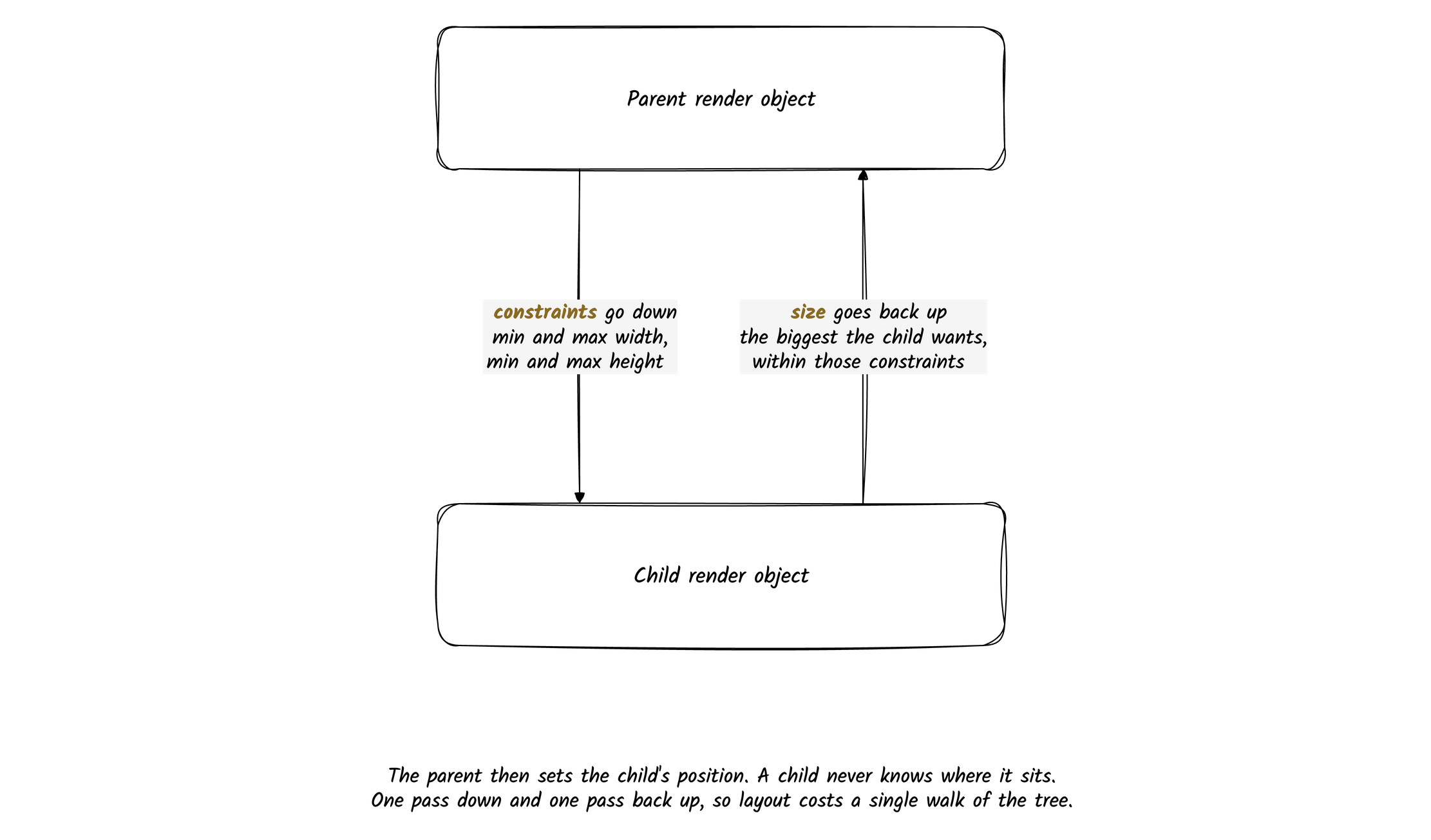
Render objects determine their size and position within the parent constraints. This happens in a two-phase process:
- First, parent render objects pass constraints down to their children
- Then, children determine their size and communicate it back to their parents
This process establishes the size and position of every visual element on the screen.
Painting
Render objects generate the visual representation that appears on screen. They produce a list of painting commands, which the engine hands to its graphics backend (Impeller on most platforms today, Skia on the web) to turn into pixels.
Hit testing
Render objects determine which UI element should respond to user inputs like taps. When a user interacts with the screen, the framework uses render objects to determine which element was touched by traversing the render tree.
Types of render object
Flutter includes various specialized render objects:
RenderBox: For box-model layout (most common)RenderSliver: For scrollable areasRenderView: The root of the render treeRenderParagraph: For text renderingRenderImage: For image rendering- Many more specialized types
How widgets map to render objects
Every visible widget in Flutter has a corresponding render object:
Container→RenderDecoratedBoxText→RenderParagraphRow/Column→RenderFlexStack→RenderStack
The connection happens through the element tree:
- Widgets create elements
- Elements create and manage render objects
When you touch them directly
Most Flutter developers rarely need to directly interact with render objects. However, there are scenarios where understanding or working with render objects becomes necessary:
- Custom painting and drawing: Creating highly custom visual elements
- Advanced layout algorithms: Implementing complex layout behaviors
- Performance optimization: Understanding the rendering pipeline for optimization
- Custom scrolling behaviors: Creating specialized scrolling effects
- Implementing new widget types: Creating entirely new widget behaviors
Render objects vs widgets
| Render Objects | Widgets |
|---|---|
| Mutable | Immutable |
| Handle actual rendering | Describe what to render |
| Long-lived | Frequently rebuilt |
| Manage concrete layout, painting | Provide configuration |
| Not directly exposed to developers | Primary API for developers |
| Focused on rendering efficiency | Focused on composition and reusability |
RepaintBoundary
RepaintBoundary puts its child on a separate layer in the render tree. Anything inside it can
repaint on its own, without forcing Flutter to redraw the rest of the screen.
How it works
When Flutter needs to repaint a widget:
- Normally, it repaints everything up the tree (its parents too).
- But if a
RepaintBoundaryis present, that subtree gets its own offscreen layer. - On changes, only that layer gets redrawn → the rest of the screen is unaffected.
Without RepaintBoundary:
└── Root
    ├── Header
    ├── AnimatedWidget (repaints frequently)
    └── Footer
→ When AnimatedWidget changes, the entire tree may repaint.
With RepaintBoundary:
└── Root
├── Header
├── RepaintBoundary
│ └── AnimatedWidget (isolated)
└── Footer
→ Only the RepaintBoundary layer repaints.When to use it
- Performance optimization
- Animated widgets (
Lottie,AnimatedContainer, etc.) - Complex graphics (
CustomPainter, charts, etc.) - Scrollable lists with expensive children
- Animated widgets (
- Capturing widgets as images (screenshots, PDF exports, sharing widgets as images). Can be used with a
GlobalKeyto capture a widget as an image (ui.Image):
final boundaryKey = GlobalKey();

RepaintBoundary(
  key: boundaryKey,
  child: Container(
    color: Colors.blue,
    width: 200,
    height: 200,
  ),
);

// Capture
RenderRepaintBoundary boundary =
    boundaryKey.currentContext!.findRenderObject() as RenderRepaintBoundary;
ui.Image image = await boundary.toImage(pixelRatio: 3.0);
Things to watch out for
| Issue | Explanation |
|---|---|
| Too many boundaries | Each creates an offscreen buffer: excessive use increases memory usage. |
| Nested boundaries | Deep nesting can reduce performance rather than help. |
| Tiny widgets | For small widgets that are cheap to repaint, boundaries add overhead. |
🧭 Rule of thumb:
Only use
RepaintBoundaryaround widgets that repaint frequently and are visually independent.
Custom painting with CustomPainter
When you want to create custom graphics, animations, or unique visual effects in Flutter, you can use the CustomPaint widget along with a CustomPainter to draw directly to the canvas. Here's a complete guide:
Basic structure
class MyCustomWidget extends StatelessWidget {
  @override
  Widget build(BuildContext context) {
    return CustomPaint(
      painter: MyCustomPainter(),
      size: Size(200, 200), // Define a fixed size or use Size.infinite to fill available space
      child: Container(), // Optional child widget that will be drawn on top of the custom painting
    );
  }
}

class MyCustomPainter extends CustomPainter {
  @override
  void paint(Canvas canvas, Size size) {
    // Drawing code goes here
  }

  @override
  bool shouldRepaint(covariant CustomPainter oldDelegate) {
    // Return true if the painting should be redone
    return false;
  }
}Paint properties
The Paint class offers many properties to customize your drawings:
color: The color to use for drawingstyle: Fill or stroke (PaintingStyle.fill or PaintingStyle.stroke)strokeWidth: Width of the stroke (for line drawings)strokeCap: How to cap the ends of lines (StrokeCap.round, StrokeCap.butt, StrokeCap.square)strokeJoin: How to join segments of paths (StrokeJoin.miter, StrokeJoin.round, StrokeJoin.bevel)blendMode: How to blend this drawing with the backgroundshader: For gradients or patterns (LinearGradient, RadialGradient, etc.)maskFilter: For effects like blur (MaskFilter.blur)filterQuality: Affects image scaling quality
Canvas drawing methods
The Canvas provides several methods for drawing:
// Drawing shapes
canvas.drawCircle(Offset center, double radius, Paint paint);
canvas.drawRect(Rect rect, Paint paint);
canvas.drawRRect(RRect rrect, Paint paint); // Rounded rectangle
canvas.drawOval(Rect rect, Paint paint);
canvas.drawArc(Rect rect, double startAngle, double sweepAngle, bool useCenter, Paint paint);

// Drawing lines
canvas.drawLine(Offset p1, Offset p2, Paint paint);
canvas.drawPoints(PointMode pointMode, List<Offset> points, Paint paint);

// Drawing paths
final path = Path();
path.moveTo(x, y);
path.lineTo(x, y);
path.quadraticBezierTo(x1, y1, x2, y2);
path.cubicTo(x1, y1, x2, y2, x3, y3);
path.arcTo(rect, startAngle, sweepAngle, forceMoveTo);
path.close();
canvas.drawPath(path, paint);

// Drawing text
final textPainter = TextPainter(
  text: TextSpan(
    text: 'Hello World',
    style: TextStyle(color: Colors.black, fontSize: 20),
  ),
  textDirection: TextDirection.ltr,
);
textPainter.layout();
textPainter.paint(canvas, Offset(x, y));

// Drawing images
canvas.drawImage(ui.Image image, Offset offset, Paint paint);
Animating a custom painter
To create an animated custom widget, you need to combine CustomPaint with animation controllers:
class AnimatedCustomWidget extends StatefulWidget {
  @override
  _AnimatedCustomWidgetState createState() => _AnimatedCustomWidgetState();
}

class _AnimatedCustomWidgetState extends State<AnimatedCustomWidget>
    with SingleTickerProviderStateMixin {
  late AnimationController _controller;

  @override
  void initState() {
    super.initState();
    _controller = AnimationController(
      vsync: this,
      duration: Duration(seconds: 2),
    )..repeat();
  }

  @override
  void dispose() {
    _controller.dispose();
    super.dispose();
  }

  @override
  Widget build(BuildContext context) {
    return AnimatedBuilder(
      animation: _controller,
      builder: (context, child) {
        return CustomPaint(
          painter: AnimatedPainter(_controller.value),
          size: Size(200, 200),
        );
      },
    );
  }
}

class AnimatedPainter extends CustomPainter {
  final double animationValue;

  AnimatedPainter(this.animationValue);

  @override
  void paint(Canvas canvas, Size size) {
    final center = Offset(size.width / 2, size.height / 2);
    final radius = min(size.width, size.height) * 0.4;

    final paint = Paint()
      ..color = Colors.blue
      ..style = PaintingStyle.stroke
      ..strokeWidth = 4;

    // Draw an animated arc
    canvas.drawArc(
      Rect.fromCircle(center: center, radius: radius),
      0,
      2 * pi * animationValue,
      false,
      paint,
    );
  }

  @override
  bool shouldRepaint(covariant AnimatedPainter oldDelegate) {
    return oldDelegate.animationValue != animationValue;
  }
}
By using the CustomPaint widget along with CustomPainter, you can create any custom graphics or visualizations in Flutter, from simple shapes to complex interactive elements.
lerp
lerp = Linear intERPolation. Blends two values by a fraction t (0 to 1).
Formula:
result = a + (b - a) * t- t = 0 → a
- t = 1 → b
- t = 0.5 → halfway
Example, radius 4 → 8:
- lerp(4, 8, 0) = 4
- lerp(4, 8, 0.5) = 6
- lerp(4, 8, 1) = 8
Where it's used here: animating between two themes. Flutter calls ThemeExtension.lerp every frame when the theme changes (light↔dark, or any FossThemeData swap). It drives a smooth transition instead of an instant jump.
Frame by frame, Flutter feeds t from 0 to 1 over the animation:
t=0.0  → old theme
t=0.3  → 30% blended
t=0.7  → 70% blended
t=1.0  → new theme
For each token it lerps the field:
- Color →
Color.lerp(channel by channel) - double (radius, spacing) → our
DoubleLerpEncoder(lerpDouble)
How the Flutter engine works
The Flutter engine is the C++ runtime underneath the framework. It owns the Dart VM, the rasterizer, the threads a frame moves through, and the bridge to the platform.
Architecture overview
Flutter is three layers, and each one is written in a different language for a different reason.
| Layer | Language | Holds |
|---|---|---|
| Framework | Dart | Material and Cupertino, widgets, rendering, animation, painting, gestures, foundation |
| Engine | C and C++ | Dart runtime and isolates, rasterizer and compositing, platform channels, frame scheduling and pipelining, text layout, asset resolution, system events, service protocol |
| Embedder | Platform specific | Render surface setup, thread setup, event loop interop, native plugins, app packaging |
The framework is everything you import. Material and Cupertino sit on top of the widget
layer, which sits on rendering, which sits on painting and gestures, which sit on foundation.
The engine is the part that never changes per platform. It owns the Dart VM, turns layer trees into pixels, schedules frames against the display refresh rate, lays out text, and carries method and event channel traffic. The service protocol here is what makes hot reload and DevTools possible.
The embedder is the per platform shim. It creates the surface Flutter draws into, sets up the UI, raster, and I/O threads, hands platform events into Flutter's event loop, and decides how the app is packaged for that platform. Porting Flutter somewhere new means writing an embedder, not an engine.
Key components
Dart runtime
The Dart runtime provides the execution environment for Flutter applications:
- Dart VM: In debug mode, the Just-In-Time (JIT) compiler enables hot reload
- AOT Compilation: In release mode, Ahead-Of-Time compilation converts Dart code to native machine code
- Garbage Collection: Manages memory automatically to prevent leaks
- Isolates: Dart's concurrency model, allowing parallel execution without shared memory
The rasterizer: Impeller and Skia
The engine turns painting commands into pixels with a graphics backend:
- Provides hardware accelerated rendering across platforms
- Delivers the same visuals regardless of device
- Handles drawing, compositing, and rasterization
- Supports shadows, gradients, and animation effects
Which backend does the work depends on the platform. Impeller is the default on iOS and on Android API 29 and above (since Flutter 3.27), and on macOS, Linux, and Windows (since Flutter 3.47). Skia still renders on the web, and is the fallback on older Android devices and devices without Vulkan. Impeller precompiles its shaders at build time, which is what removed the first run shader jank Skia was known for.
Platform channels
Platform channels enable communication between Flutter's Dart code and native platform code:
- Method Channels: For request/response communication patterns
- Event Channels: For streaming data from native to Dart
- Message Codecs: Serialize and deserialize data between Dart and native code
Text rendering
The engine includes a text rendering subsystem:
- Handles font selection, shaping, and rendering
- Manages complex text layout including bidirectional text
- Supports multiple languages and scripts
The rendering process
This is the same frame as the four trees section above, seen from below the framework. What to do when one of these steps runs long is in performance.
When a Flutter app runs, the engine follows this sequence:
- Animation/Input Processing: Processes input events and animation frames
- Layout: Determines size and position of elements
- Compositing: Creates layer trees representing the UI
- Rasterization: Converts layer trees to pixel data
- GPU Rendering: Sends drawing commands to the GPU
Each frame in Flutter aims to complete within 16.67ms (for 60fps animations). The engine orchestrates this process to maintain smooth performance.
Threading model
The Flutter Engine operates with multiple threads:
- Platform Thread: Handles communication with the host OS
- UI Thread: Executes Dart code and builds the widget/element trees
- GPU Thread: Handles GPU-bound tasks like shaders and textures
- I/O Thread: Manages asynchronous I/O operations
This multi-threaded architecture helps maintain UI responsiveness even during intensive operations.
Engine initialization
When a Flutter app launches:
- The platform-specific embedder initializes
- The embedder creates and configures the Flutter Engine
- The engine initializes the Dart VM and loads the app's compiled code
- The engine sets up rendering surfaces and input handling
- The
main()function in your Dart code is called, followed byrunApp()
What makes it different
Flutter's engine does not use the platform's native UI components. It draws every pixel itself through its own graphics backend, which buys:
- Consistent UI across platforms
- Predictable performance characteristics
- Freedom from platform-specific UI limitations
Understanding the internal workings of the Flutter Engine helps developers make informed decisions about app architecture, performance optimization, and platform integration.
In Flutter, widgets are the building blocks of the UI. The two main types of widgets are:
1. StatelessWidget
A StatelessWidget is immutable, meaning that its properties cannot change once they are set. It only rebuilds when its parent forces a rebuild by providing different constructor arguments.
When to use a StatelessWidget?
• When the UI does not change dynamically.
• When the widget depends only on external data (passed through constructor).
• When the widget does not need to manage any state internally.
Example of a StatelessWidget:
class MyStatelessWidget extends StatelessWidget {
  final String text;

  const MyStatelessWidget({super.key, required this.text});

  @override
  Widget build(BuildContext context) {
    return Text(text);
  }
}
2. StatefulWidget
A StatefulWidget is mutable and has a State object that holds data that can change during its lifecycle. The UI updates when the state changes using setState().
When to use a StatefulWidget?
• When the UI needs to change dynamically based on user interaction or internal logic.
• When you need to manage state internally, such as animation controllers, timers, form inputs, or API responses.
• When the widget needs to persist local state across rebuilds.
Example of a StatefulWidget:
class MyStatefulWidget extends StatefulWidget {
  const MyStatefulWidget({super.key});

  @override
  State<MyStatefulWidget> createState() => _MyStatefulWidgetState();
}

class _MyStatefulWidgetState extends State<MyStatefulWidget> {
  int counter = 0;

  void _incrementCounter() {
    setState(() {
      counter++;
    });
  }

  @override
  Widget build(BuildContext context) {
    return Column(
      children: [
        Text('Counter: $counter'),
        ElevatedButton(
          onPressed: _incrementCounter,
          child: const Text('Increment'),
        ),
      ],
    );
  }
}
Key Differences
| Feature | StatelessWidget | StatefulWidget |
|---|---|---|
| Mutability | Immutable | Mutable |
| Rebuilds on UI changes? | No (only when parent updates) | Yes (when setState() is called) |
| Use Case | Static content | Dynamic content |
| Example | Text, Icons, Images | Animations, Form Inputs, Timers |
General Rule of Thumb
• Use StatelessWidget when the UI does not change after it is built.
• Use StatefulWidget when you need to store and manage local state that affects the UI.